
The Solution
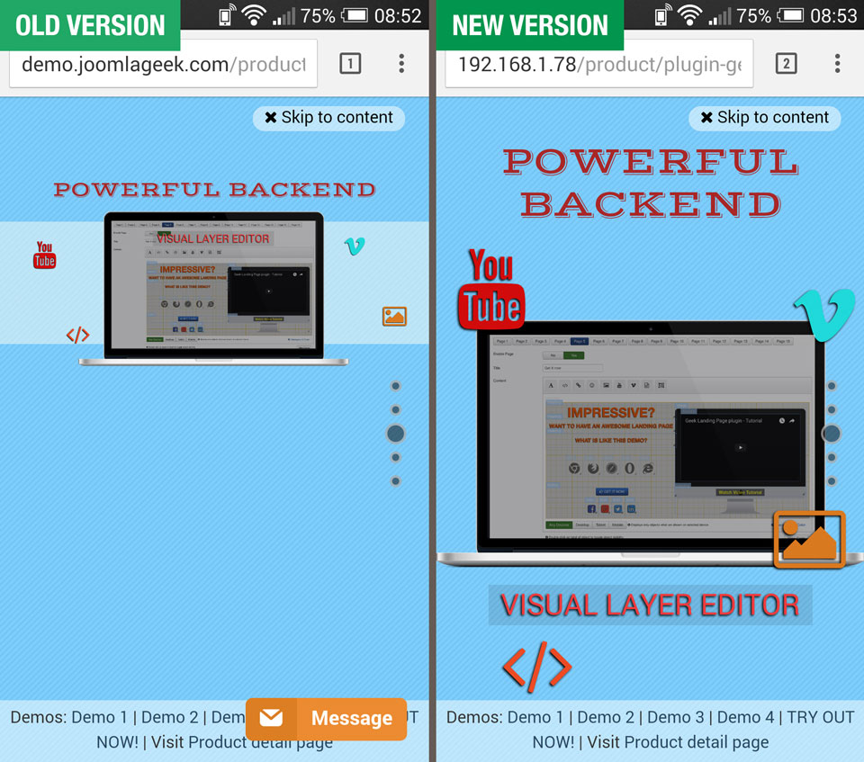
The solution that we used in this version is to support users to create an entirely new, dedicated layout for Mobile Portrait view, and the old mobile layout will be only used for Mobile Landscape view. This new feature helps to use up all the space of the phone screen when viewing on Portrait mode, which means that you can display more information, and this update also fixes the issue of the content displaying too small on mobile screen.
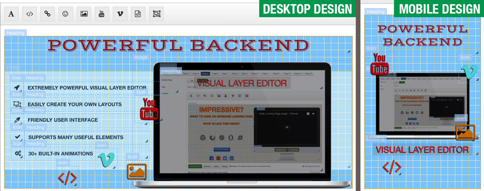
In this new version, when building landing page, you will see the new "Mobile Portrait" button in the button group that is used to switch layout for each device type that is below the Visual Layer Editor. Click on this button to switch to design mode for Mobile Portrait view, in this mode, the dimension of Visual Layer Editor will be resized to fit with the dimension of the most popular mobile devices (320px x 480px)
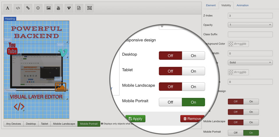
Besides, when editing objects of page, in tab Visibility > section Responsive Design in form of object properties, you will see the new parameter to show/ hide objects on Mobile Portrait. Note: because the dimension of Mobile portrait view is different from other views, so if you set an object "shown" on Mobile portrait view, you must also set it "hidden" on other views to ensure that landing page will be displayed properly on all devices, and avoid unexpected errors.
Warning
Because the new version uses an entirely new, dedicated layout for Mobile portrait view, therefore after upgrading to the new version, you will see that your landing page will be displayed blank on Mobile portrait, and you need to redesign the content for your page on this view.
Tips
- You can quickly create a layout for Mobile Portrait by cloning objects from Mobile Landscape view, then resizing, sorting them and updating their responsive settings to get expected design for Mobile portrait.
- If you create a new object on Mobile Portrait design mode, its responsive settings will be automatically updated to suit this view.
- You can download and reinstall sample package to update new content for sample profiles
If you find any issues with this new feature, please report it on forum here
Or if you find satisfaction with this update, please leave a comment below :)