
Basic Settings
- Load Bootstrap:If Yes, the plugin will load bootstrap framework. Note: if your template is not based on bootstrap framework, you might face with some issues of responsive like element hidden or shown in correctly on specific devices as you designed in backend, enable this setting to fix the issue.
- Cookie name: The plugin will create a cookie along with a given name field on the client side to store the last time the landing page was loaded, this data will be used to control whether or not the page will be displayed to the user next time (based on Displaying Frequency setting). In case you have a new landing page for a new campaign that you want to show to users, you must change the value of this field to make new contents appear immediately to users.
- Displaying Frequency: Defines the frequency with which that page is displayed to users.
- Displaying Delay: The delay time (in seconds) before the landing page appears in your site.
- Appear Effect: Select an effect when the landing page is loaded.
- Auto Close: Automatically close Landing page after N seconds. Enter 0 to disable this feature.
- Disappear Effect: Select an effect when the landing page is closed
- Maximum Screen Width: Specifies the maximum width of a content area (Learn more).
- Show Footer Text: Show or hide Footer Text.
- Footer text: Specify the text shown on page footer
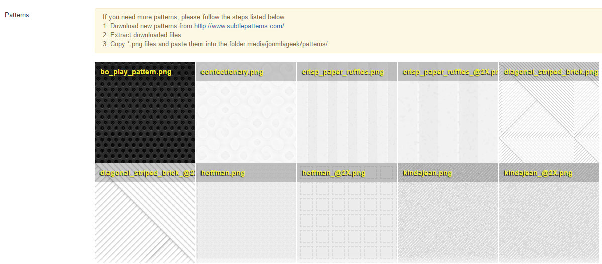
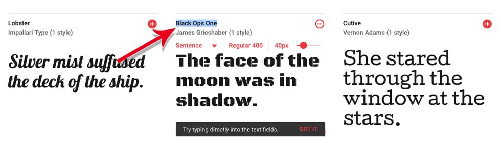
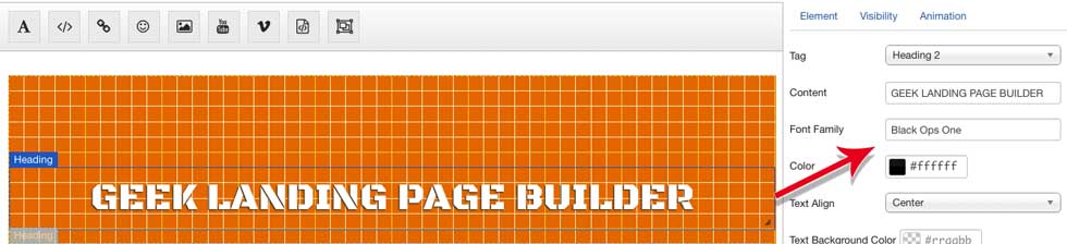
- Google Fonts: Enter Google Fonts which you want to use in your site. (Learn more).

Embed Google Fonts + Set Font family for elements
Enter Google Fonts which you want to use in your site.
1. You can find the list of Google Fonts at https://fonts.google.com/
2. Copy name of Font that you want to use and paste it into Google Fonts textarea field (separate by newline)
3. You can set selected fonts for Heading, HTML, buttons elements of landing page. See how to update object's properties
NOTE: Beside of Google Fonts, you can use Web safe fonts listed here
Maximum Screen Width
Specifies the maximum width of a content area.
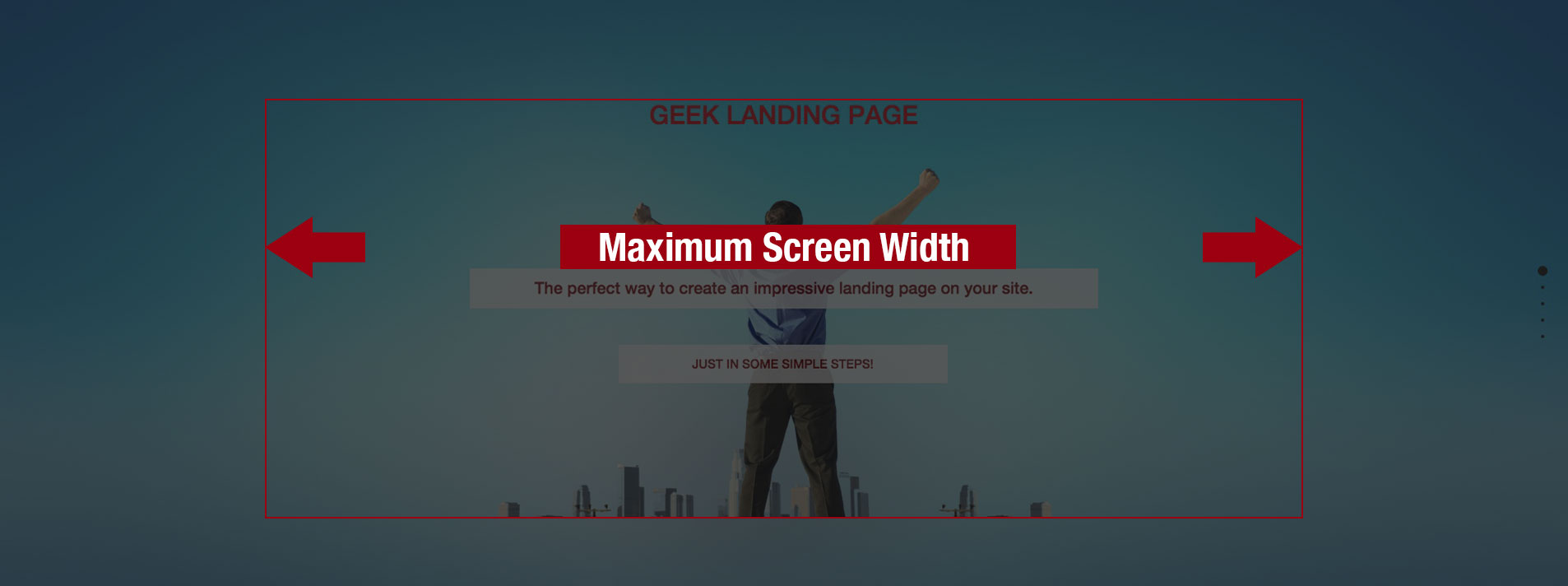
This helps to make your page will be displayed exactly what you designed on Layer editor in backend.
For example, if the value of Maximum Screen Width parameter is 1200px, then the dimension of content area will be 1200px x 525 px, where its heigh will be calculated by following formula:
heigh = 1200 x 420 / 960;
If the screen size of your device is smaller than value of "Maximum Screen width" parameter, then the dimension of content area will be calculated based on width of your device.
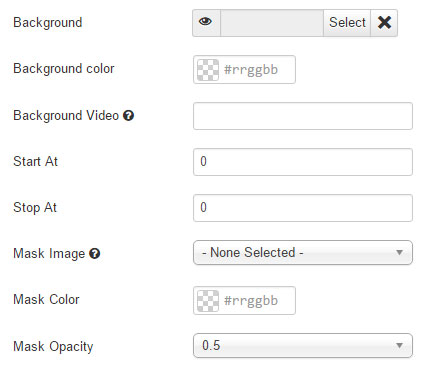
Global Background Settings
This section is used to set global background for whole landing page. You can change the background of each page in page setting sections (See Manage pages section).
- Background: Select a background image.
- Background Color: Select the background color of page
- Background Video: Set background video by entering a YouTube Video ID or YouTube Video URL. This global video background is always AUTO PLAY and HIDE CONTROLS.
- Start At: Specific part of a video on YouTube to play.
- Stop At: Specific part of a video on YouTube to stop
- Mask Image:Select Mask Image over background.
- Mask Color :Select Mask Color over background.
Manage pages
Edit page screen
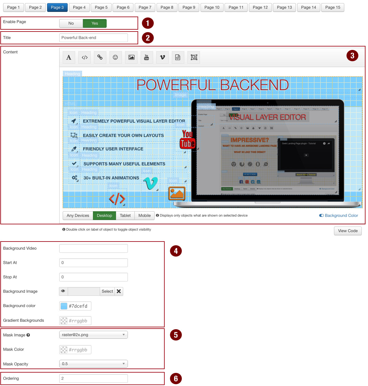
Enable page
- The plugin supports to create up to 15 pages. You can specify which pages are shown by changing the value of "Enable Page" field (#1 on image) to "Yes".
Page title
- The page title will be displayed as title of navigation's dots.
Set background of page
- You can set background video, image or background color for the page
Set mask over background
- You can frame background page in a seasonal theme with a quick and easy way to mask images using a transparent mask PNG and mask color
Edit page content
- See Visual Layer editor section for how to use it to mange a page's content.
Sort pages
- You can change the ordering of pages by updating value of Ordering field (#5 on image). A page with lower displaying order is shown before a page with greater displaying order.
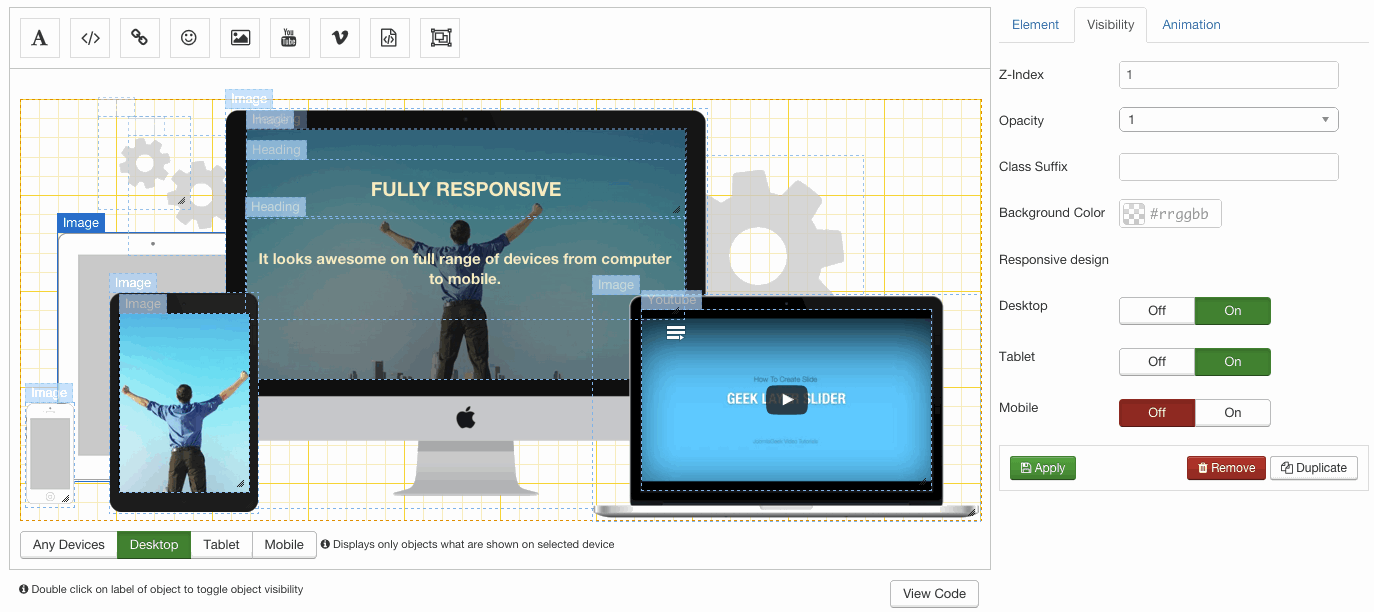
Visual Layer Editor
Screen explanation
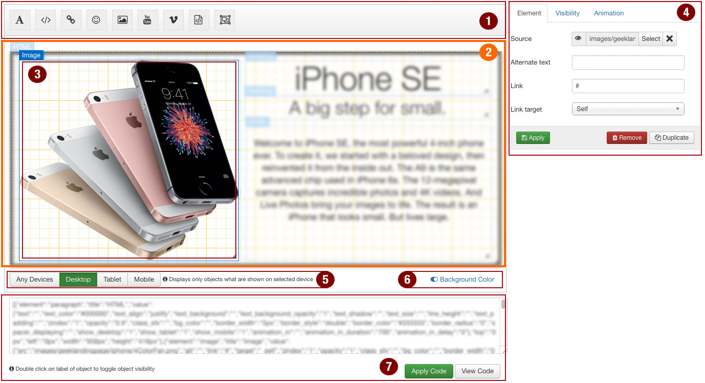
- 1- Toolbar
- 2 - Editor
- 3 - Object
- 4 - Object’s properties form
- 5 - Responsive Design
- 6 - Toggle Background Color
- 7 - View / Apply Code
Create an Object
- Drag and drop elements from Toolbar to Editor to create an Object
Update Object’s properties
- Drag an object to change its position.
- Click on edges or bottom right corner of object and drag to change its size.
- Click on Object or label of object to open setting form on right side of Editor where you can update its properties. Once you update object’s properties, click on Apply button to save changes.
Remove an Object
- Click on Object or label of object to open setting form on right side of Editor.
- Click on Remove button on property form to remove an object.
Duplicate an Object
- Click on Object that you want to duplicate.
- Click on Duplicate button to quickly clone an object.
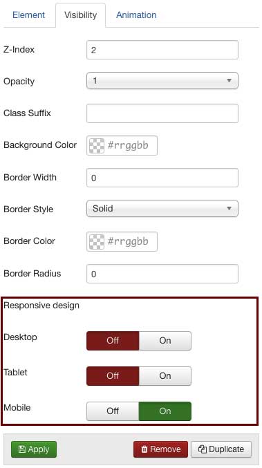
Edit visibility of Object
Click on Object or label of object to open setting form on right side of Editor then Click on Visibility Tab
- z-index: specifies the stack order of an element. An element with greater stack order is always in front of an element with a lower stack order.
- Opacity: The opacity property sets the opacity level for an element. The opacity-level describes the transparency-level, where 1 is not transparent at all, 0.5 is 50% see-through, and 0 is completely transparent.
- Class Suffix: A Suffix to be applied to the CSS class of Object. This allows individual element styling.
- Background Color: Select the background color of an Object.
- Border Width: Specify the width of the border of an Object. The width can be set as a specific size (in px, pt, cm, em, etc) or by using one of the three pre-defined values: thin, medium, or thick.
- Border Style: Specifies which style of border to display.
- Border Color: Set the color of the border
- Border Radius: Add rounded borders to element.
- Desktop: If enabled, an Object will be shown on desktop devices (screen size is 980px and up). Otherwise, it will be hidden.
- Tablet: If enabled, an Object will be shown on tablet devices (screen size is between 768px and 979px). Otherwise, it will be hidden.
- Mobile: If enabled, an Object will be shown on mobile devices (screen size is 767px and below). Otherwise, it will be hidden.
- TIP: Double click on label of object to toggle object visibility. This helps you can update object that is hidden by other objects.
Responsive Design
Geek Landing page plugin supports to configure elements to display only on specific devices (See Edit visibility of Object section)
This feature allow you to create different layouts for desktop, table and mobile.
You can click on buttons in a button group below a Visual Layer Editor to how the page will be displayed on specific devices.
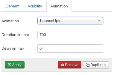
Edit animation of Object
Click on Object or label of object to open setting form on right side of Editor then Click on Animation Tab
- Animation: Select an animation effect when object appear.
- Duration: Defines how many milliseconds an animation takes to complete one cycle.
- Delay: Specifies a delay (in milliseconds) for the start of an animation.
View Code (Since version 2.5.0)
This feature is useful if you want to quickly create a new page based on current ones. In this case you can follow steps listed below:
- - Copy source code of editor in the page that you want to edit from
- - Paste it into textarea (what contains source code of editor) of new page. NOTE: you must clear all code in target textarea if any before paste new code into.
- - Click on Apply Code button to let Editor render code to objects
Toogle Background Color of Editor
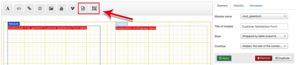
Load Module / Module Position on page
Load Module and Module Position elements on toolbar of Visual Layer Editor allow you to load Module and Module Position on Landing page.
NOTE: If your module does not display on page, please check if it is published and assigned to the page where landing page is displayed.
Important note


Watch a video below for more detail
Navigation Settings
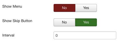
- Show Menu: If Yes, Menu will be displayed on the top left corner of the page.
- Show Skip Button: If Yes, it will display the Skip to Content link on the top right corner of the page.
- Interval: The amount of time (in milliseconds) to delay between automatically cycling a page. If 0, Landing page will not automatically cycle.
- Direction: Specifies the scrolling direction
Vertical Scrolling Settings
- Navigation: If Enabled, it will show a navigation bar made up of small circles.
- Position: Selects which position the navigation bar will be shown.
- Show Active Tooltip: Shows a persistent tooltip for the actively viewed section in the vertical navigation.
- Continuous Vertical: Defines whether scrolling down in the last section should scroll down to the first one or not, and if scrolling up in the first section should scroll up to the last one or not.
- Use Anchors: If Enabled, it will update hash (anchor part) of a URL when scrolling.
- Record History: Defines whether to push the state of the site to the browser's history. When set to true each section/slide of the site will act as a new page and the back and forward buttons of the browser will scroll the sections/slides to reach the previous or next state of the site. When set to false, the URL will keep changing but will have no effect ont he browser's history. This option is automatically turned off when using autoScrolling:false.
- Keyboard Scrolling: Defines if the content can be navigated using the keyboard.
- Touch Sensitivity: Defines a percentage of the browsers window width/height, and how far a swipe must measure for navigating to the next section / slide.

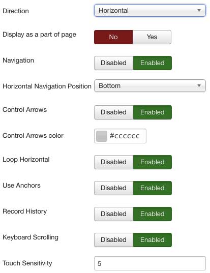
Horizontal Scrolling Settings
- Display as a part of main page: If Enabled, Landing page will be displayed as a slider on main page instead of fullscreen popup. (Learn more)
- Navigation: If Enabled, it will show a navigation bar made up of small circles.
- Position: Selects which position the navigation bar will be shown.
- Control Arrows: Determines whether to use control arrows for the slides to move right or left.
- Control Arrows Color: Set a color for Control Arrows.
- Loop Horizontal: Defines whether horizontal sliders will loop after reaching the last or previous slide or not.
- Use Anchors: If Enabled, it will update hash (anchor part) of a URL when scrolling.
- Record History: Defines whether to push the state of the site to the browser's history. When set to true each section/slide of the site will act as a new page and the back and forward buttons of the browser will scroll the sections/slides to reach the previous or next state of the site. When set to false, the URL will keep changing but will have no effect ont he browser's history. This option is automatically turned off when using autoScrolling:false.
- Keyboard Scrolling: Defines if the content can be navigated using the keyboard.
- Touch Sensitivity: Defines a percentage of the browsers window width/height, and how far a swipe must measure for navigating to the next section / slide.
Display as a part of main page
By default, the Landing page will be displayed as a fullscreen popup, user needs to click on "Skip to content" button to close it then view the main web page.
However, in version 3.1.0, Plugin supports new feature which allows you to display landing page as a fullscreen slider on main web page.
Please follow steps listed below to configure :
- 1. Click on Navigation tab
- 2. Select Horizontal option under Direction parameter (NOTE: This feature only works with Horizontal scroll)
- 3. Enable "Display as a part of page" parameter
- 4. By default, Slider will display on the top of page. If you want to display it on another position of main page, you can add a short code {landingpage} on the main page where you want to display a slider.
- Tips: you can create custom HTML module and add short code {landingpage} on its content, then assign module to position where you want to display the Slider.
- NOTE: Please note that the position must be a fullscreen width one.
Manage Profiles (Since version 2.5.0)
The Profile Management screen shows as follows:
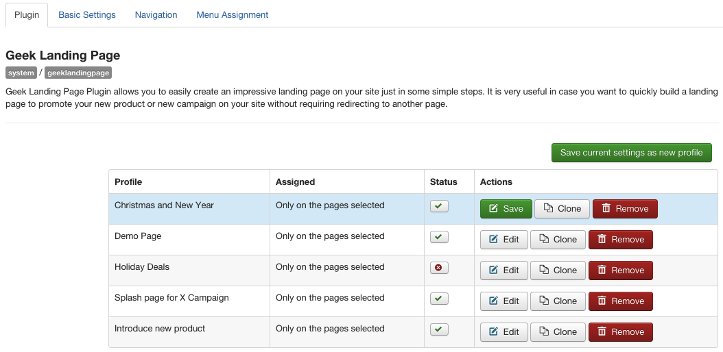
Create new profile
- Click on Save current settings as new profile green button
- Enter name of profile in prompt dialog box
- Click on OK button
- You must use different cookie names for each profiles
- You must assign landing pages to different menu items (in Menu assignment tab). If multiple landing pages are assigned to the same menu item, then only one will be displayed.
- Plugin's settings is higher priority than profiles' settings. This means when the web page is rendered, it will check in plugin's settings if the plugin is assigned to current page, then it will render landing page based on plugin's settings, otherwise it will continue check in profiles' setting.
Edit profile
- Click on Edit button and waiting for the page is reloaded
- Update settings of landing page in other tabs (Basic settings, Navigation, Menu assignment)
- Once done, back to the first tab and click on Save button to save current settings to profile (use the Save button in Manage profile section, not Save button on the toolbar)
Clone profile
Enable/Disable profile
Delete profile
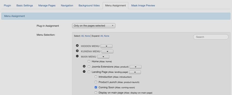
Assign a Landing Page to specific pages
Open the Menu Assignment tab of the plugin
You can choose between On all pages, No pages, Only on the pages selected, On all pages except those selected from the List. To assign to some but not all pages choose the third option and select the menu links that you want the Landing page associated with.
Mask Image Preview
This panel allows users to check how mask over background looks on visual editor.